
Steppe Landscapes
Logo Development
Final Approved Logo
The illustration combines the of attributes of several of your flowers — it’s a native, low-water frankenflower, implemented in a abstracted modernist style reminiscent of Charlie Harper. We decided it’s actually be beneficial to intentionally avoid being too species-specific.
Oh, and here’s my initial illustration including a cute butterfly, which could be useful sometime!
COLOR SCHEME
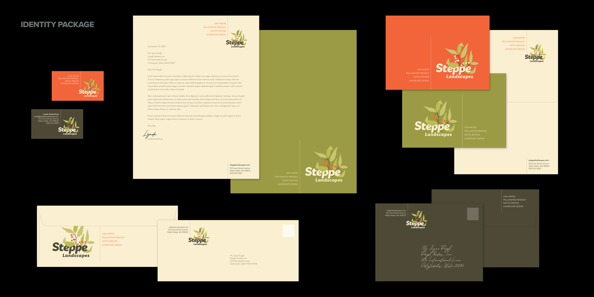
The logo works well over each of the four colors. Note that these are not four different logos, just implementations of the one approved logo — see the business card, letterhead, envelope, note card, and presentation folder below for examples of how this works in application.
Brand application of approved logo:


The project will benefit from a tagline to be used along with the logo on printed materials. I’ve used a boringly literal temporary placeholder, but it wouldn’t need to be terribly clever.
Just for fun:
ALTERNATE COLOR SCHEME AND TYPE TREATMENTS


Four Initial Concepts
1
MODERNIST
Bold, clean, slightly whimsical. Evoking Charlie Harper, mid-century. This is my favorite, for what that’s worth.
Greens and cream with red-orange accent.
Concept is based on provided illustration style example to be replaced with custom illustration of specific plant(s) — Globe Mallow, Rubber Rabbitbush, possibly with a butterfly or bird. This illustration will be sufficiently time-consuming that we didn’t want to get too far into it until this concept is chosen.
2
BOTANICAL
Detailed but not fiddly. Evoking botanical prints, National Parks, seed packets.
Dark sage base and light yellow with accent color mostly from multiple plant illustrations.
We’ll need to find botanical illustrations of half a dozen specific plants to use. These illustrations will be used interchangeably — multiple individual plants in order to show breadth and variety without it turning into a bouquet.
3
CONTEMPORARY
Clean and contemporary but not trendy. Simple but asymmetrical. Circle holds the space for the Illustration which determines a significant amount of the tone.
Dark sage base and light yellow with accent color mostly from multiple plant illustrations.
Concept is based on provided illustration style example which could be replaced with custom illustration. Like concept number two, we could make use of multiple individual plant illustrations.
4
EXTRA BOLD
Punchy and solid but playful. Customized typography with overlapping extra bold letterforms. Note that if we like the concept but not the style, we can develop different type.
The type holds photographic content that provides color. Solid-color logo variant could be simply black or colors of our choosing that coordinate with the chosen fill images.
We’d need to find appropriate plant photographs. We could either try to get a photograph that has several different plants or use multiple individual options like concepts two and three.
Potential brand application of logo concept number one:

The project will benefit from a tagline to be used along with the logo on printed materials. I’ve used a boringly literal temporary placeholder, but it wouldn’t need to be terribly clever.