Hillslide Orchards
LOGO UPDATE OPTIONS
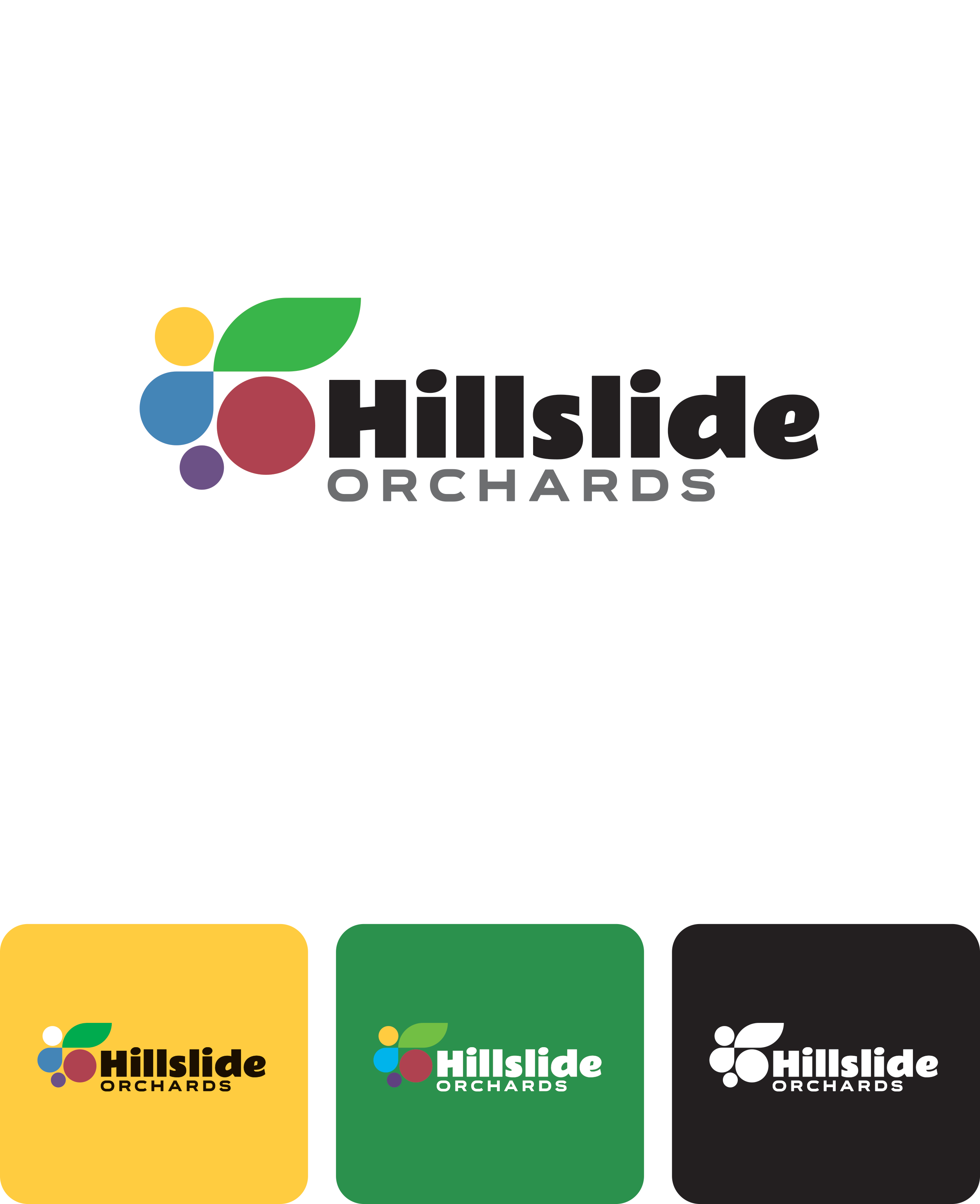
1. Clean and Modern, Serious but Friendly
Blue, green, and red colors reference the current logo. Abstracted colored shapes represent diverse products (tree fruits, row crops, grapes, grass seed) plus sun and water (essential for growth and a nod toward solar power and sustainable irrigation).
Positives: Professional without feeling corporate. Can work well on white or a solid color. The monochrome version works equally well in white or black. Easily reproducible — print, cut vinyl, signage, screen printing, embroidery.
Potential negatives: Not much continuity with current branding beyond some of the colors. A little too slick, maybe?
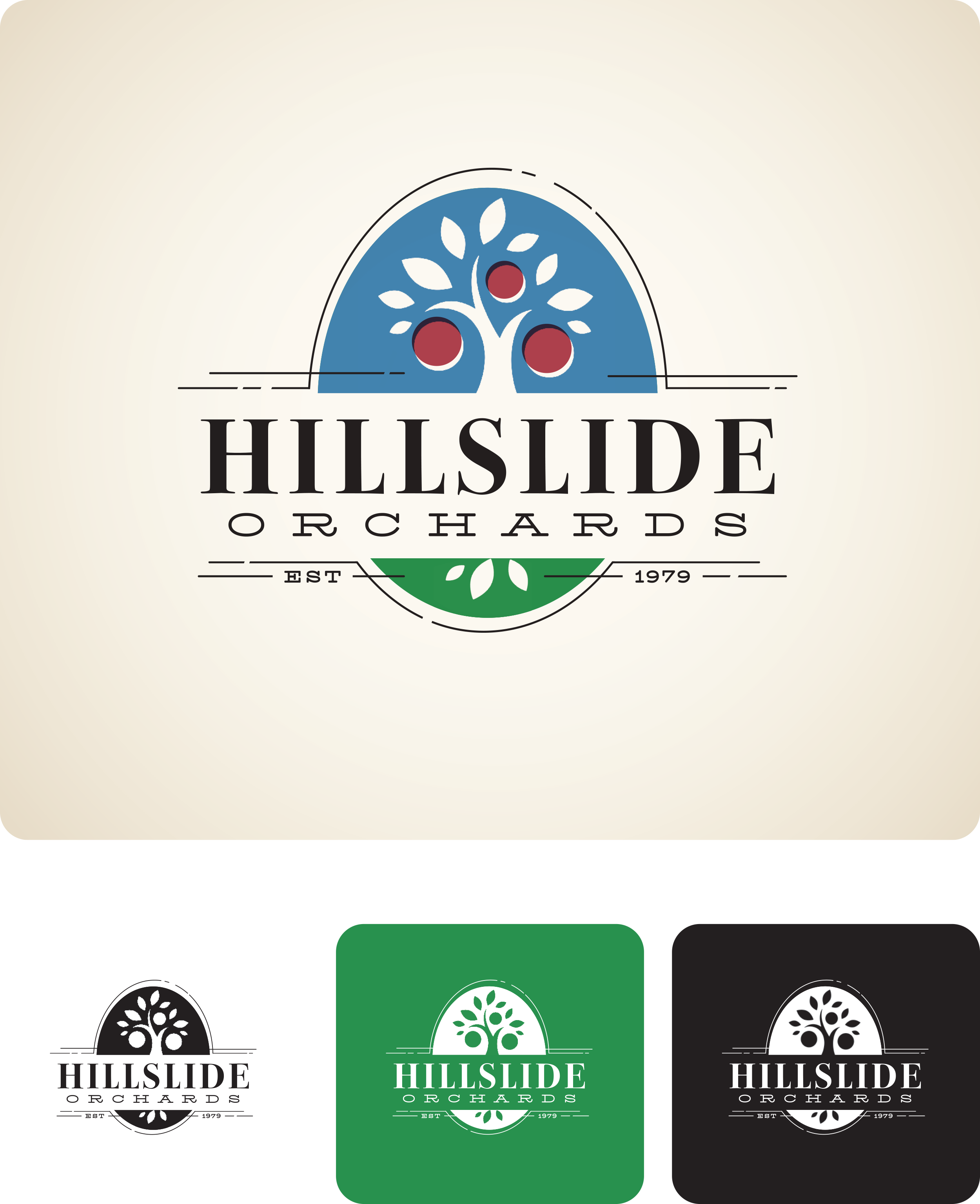
2. Vintage Family Farm
Heavily references the current logo — tree, colors, vertical oval shape, even the “Hillslide” type is the font from the barn. The tone is purposefully vintage with a quirky, modern implementation. Leans heavily on historical associations, tradition, family farms, Betty Crocker Cookbook, etc.
Positives: Continuity with current and past branding, family farm image. Can work well in color on white or reversed on green or blue. The monochrome version works equally well in white or black.
Potential negatives: Design detail level makes it less easy to reproduce at smaller sizes — embroidery might need a simplified version. Tree references the past, but potentially too specific to a tiny part of your current production?
3. Modern Circle
Simple, graphic, illustrative representation of row crops, orchard crops, and the sun. Type is clean and modern, vaguely vintage.
Positives: Broad crop representation. White border on the circle makes it very flexible and easy to use in various situations. Can work well on white or a solid color. The monochrome version works equally well in white or black. Easily reproducible — print, cut vinyl, signage, screen printing, embroidery.
Potential negatives: This logo has little continuity with current or past logos except for colors. Style may be too simplistic.
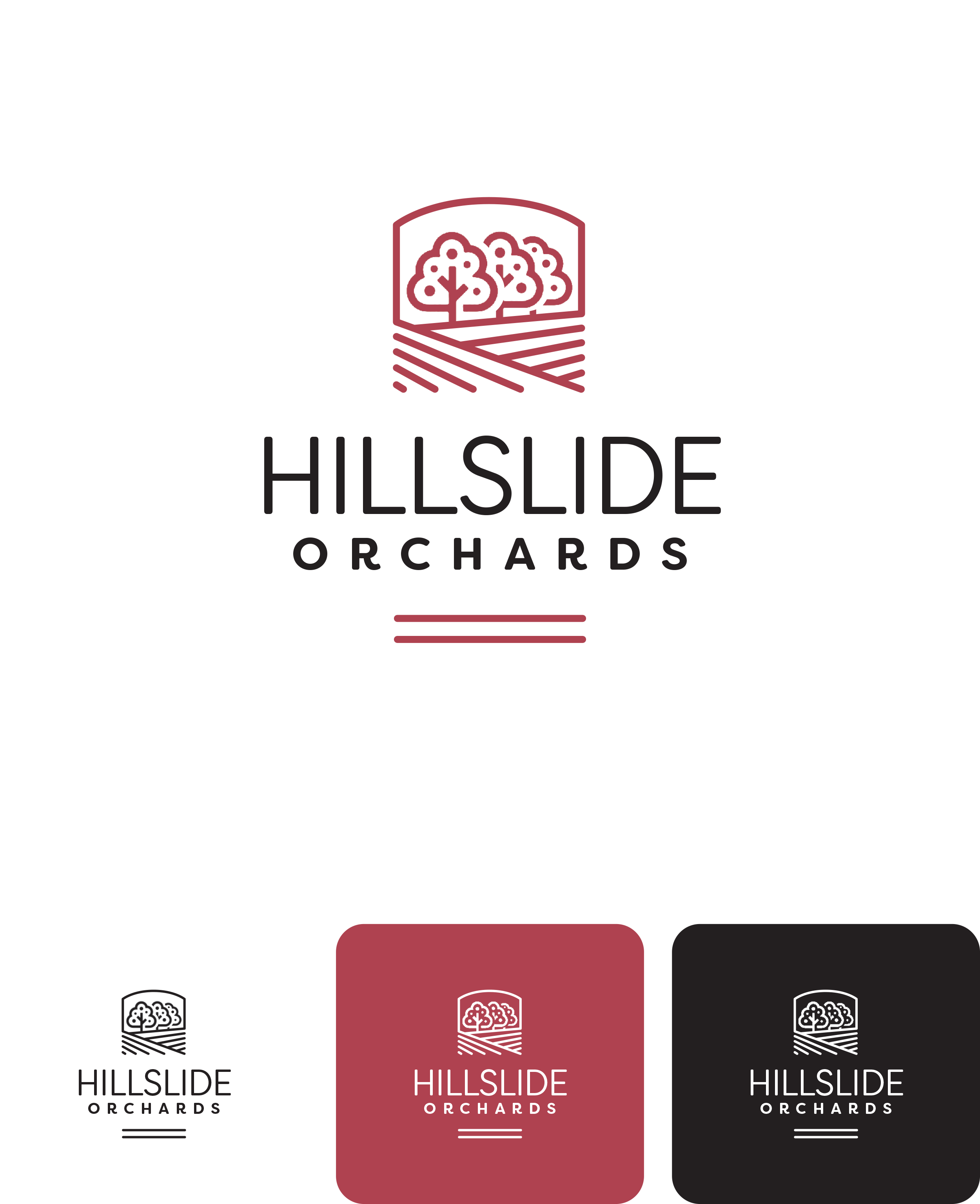
4. Contemporary Lineart Badge
Simple, graphic, illustrative representation of row crops and orchard crops. Type is clean and contemporary.
Positives: Contemporary Northwest style. Broad crop representation. Minimalist design makes it very flexible and easy to use in a wide variety of situations. It can work well on white or a solid color. The monochrome version works equally well in white or black. Easily reproducible — print, cut vinyl, signage, screen printing, embroidery.
Potential negatives: Very little continuity with the previous logo. Appropriate style?
5. Bold Big-Ag
Clean, bold, and typography-driven, with prominent sun imagery and a subtle nod to “slide.” The fonts are clean but quirky enough to not feel overly austere or aggressively corporate.
Positives: Feels solid and established and… not so little as you used to be. But with a little sense of humor. Flexibility of not being crop-specific. Clean design makes it versatile and easy to use in a variety of situations. Can work well on white or a solid color. The monochrome version works equally well in white or black. Easily reproducible — print, cut vinyl, signage, screen printing, embroidery.
Potential negatives: Almost no continuity with the previous logo. Appropriate tone?
6. Vintage Orchard Industry Typography
Friendly but clean retro commercial typography with script lettering and crosshatch shadowing. References your region’s historic fruit industry.
Positives: Feels historical but not crop-specific (well, as much as possible with the word “orchards” in the name). Can work well on white or a solid color. The monochrome version works equally well in white or black. Easily reproducible — print, cut vinyl, signage, screen printing, embroidery (embroidery version simply loses the shadow). Could potentially have an additional element — apple, tree, grapes, grass, field of row crops…
Potential negatives: No design continuity with current or past logos. Maybe too old-looking? It’s referencing the history of your industry as a whole more than you specifically.


